2018 is upon us, the holiday's are finished for now so time to get back to coding! We're going to create a custom admin theme using uikit 3.
There is a now an (even) cooler way to do this through a new module:
1) Install NodeJS. On windows you can just grab the official installer and on OSX you can use this guide.
2) You can now get the AdminThemeUIkit module via git clone from github into '/site/modules/'.
cd C:\Users\Sam\Dropbox\dev\pw.tuts.dev\site\modules\
git clone https://github.com/ryancramerdesign/AdminThemeUikit.git3.1) Copy the 'AdminThemeUikit/uikit/custom/' folder to somewhere else like the desktop, you will need this.
3.2) Delete the folder 'AdminThemeUikit/uikit/'.
3.3) Git clone or download zip and extract it - green button > download zip) to your 'site/modules/AdminThemeUikit/' folder.
3.4) Copy the 'custom' folder you saved in step 3.1 back into uikit the folder.
In terminal/cmd, run (change paths to reflect your own path to the 'site/modules/AdminThemeUikit/' folder):
cd C:\Users\Sam\Dropbox\dev\pw.tuts.dev\site\modules\AdminThemeUikit

# to update uikit, delete existing folder and run
git clone https://github.com/uikit/uikit.git
NOTE: If you downloaded the uikit 3 zip file from github, you will have to rename this from 'uikit-develop' to 'uikit'.
Now you have a path '/site/modules/AdminThemeUikit/uikit/'.
Next, you need to install the npm package manager globally in order to use the npm command and move into the 'uikit' folder. Uikit 3 also has a bunch of dependencies that need to be installed in order for successful compilation of the source files. The dependencies are listed in '/site/modules/AdminThemeUikit/uikit/package.json' file under 'devDependencies'.
In terminal/cmd, run:
npm install npm -g
cd uikit
npm install
4) Create a new less file which will be used for your custom theme. For the sake of ease, here's my theme which should offer a starting point. I made this by copying the contents of 'pw-theme-reno.less' into this new file and modified it to add page background colour control, consistent login screen colours, ability to use smaller margins throughout, different logo effect, some text changes, more subtle warnings/errors and so on. This means you'll most likely only need to change a few variables at the top and re-compile (instructions to follow).
/**
 *
 * Theme: AdminThemeUikit custom
 *
 */

// Custom colour scheme
@orange: #f0ad4e;
@teal: #2a92a3;
@pink: #ff5b77;
@pink-light: #ffe7ea;
@purple: #613d7c;
@blue: #648db2;
@green: #25b076;
@red: #ab1711;
@yellow: #e5e8b1;
@black: #000000;
@white: #ffffff;
@orange: #ed912d;

// Grayscale
@gray-dark: #565656;
@gray: #7c7c7c;
@gray-light: #b7b7b7;
@gray-lighter: #ececec;
@gray-lightest: #f7f7f7;

// Smaller margins
@global-margin: 5px;

/**************************************************************
 * Primary variables
 *
 * The entire color theme can be adjusted from the @theme
 * variables below.
 *
 */

@theme-primary-background: @teal;
@theme-secondary-background: @gray-lighter;

@theme-text-color: @gray-dark;
@theme-link-color: @theme-text-color;
@theme-link-hover-color: @theme-primary-background;

@theme-dark-background: @gray-dark;
@theme-muted-background: @gray-lighter;
@theme-muted-text-color: @gray;
@theme-muted-text-color-alternate: @gray;

@pw-body-background: @gray-lightest;
@theme-tabs-wrapper-background: @theme-muted-background;

@theme-slider-color: @theme-primary-background;
@pw-slider-range-background: @theme-slider-color;
@pw-slider-background: lighten(@theme-slider-color, 20%);

@theme-success-background: @white;
@theme-success-color: @theme-text-color;

@theme-warning-background: @orange;
@theme-warning-color: @white;

@theme-danger-background: @pink-light;
@theme-danger-color: @red;

@theme-alert-background: @green;
@theme-alert-color: @white;

@theme-primary-headline-color: @gray-dark;
@theme-secondary-headline-color: lighten(@theme-primary-headline-color, 30%);

@theme-notes-text-color: @theme-text-color;
@theme-notes-background: @theme-muted-background;

@theme-masthead-background: @theme-muted-background;
@theme-masthead-link-color: @gray-dark;
@theme-masthead-link-hover-color: @theme-primary-background;
@theme-masthead-link-current-color: @theme-masthead-link-hover-color;
@theme-masthead-icon-color: @gray-dark;
@theme-masthead-search-text-color: @gray-dark;
@theme-masthead-search-background: @white;
@theme-masthead-search-border-color: darken(@theme-muted-background, 10%);
@theme-masthead-search-focus-background: @theme-masthead-search-background;
@theme-masthead-search-focus-text-color: @theme-masthead-search-text-color;
@theme-masthead-search-focus-border-color: @theme-primary-background;
@theme-masthead-search-icon-color: @theme-masthead-icon-color;

@theme-button-text-color: @white;
@theme-button-background: @theme-primary-background;
@theme-button-hover-background: darken(@theme-primary-background, 10%);
@theme-button-secondary-background: @green;

@theme-dropdown-background: @white;
@theme-dropdown-color: @theme-text-color;
@theme-dropdown-hover-background: @theme-muted-background;
@theme-dropdown-border-color: @theme-muted-background;
@theme-dropdown-border: 1px solid @theme-dropdown-border-color;
@theme-dropdown-nav-icon-color: @theme-text-color;

@theme-page-list-link-color: @theme-link-color;
@theme-page-list-link-open-color: lighten(@theme-link-color, 10%);
@theme-page-list-icon-color: @theme-link-color;
@theme-page-list-link-active-color: darken(@theme-link-color, 10%);
@theme-page-list-link-hover-color: @theme-link-hover-color;
@theme-page-list-action-link-color: @white;
@theme-page-list-action-link-background-color: @theme-primary-background;
@theme-page-list-action-link-hover-color: @white;
@theme-page-list-action-link-hover-background-color: darken(@theme-primary-background, 10%);

@theme-inputfield-border: 1px solid @gray-lighter;
@theme-inputfield-input-background: @white;
@theme-inputfield-input-border-color: darken(@gray-lighter, 5%);

@theme-form-radio-checked-background: @theme-muted-text-color-alternate;

@theme-offcanvas-text-color: @theme-text-color;
@theme-offcanvas-link-color: @theme-text-color;
@theme-offcanvas-link-hover-color: @theme-link-color;
@theme-offcanvas-link-open-color: @theme-link-color;
@theme-offcanvas-background: @theme-secondary-background;
@theme-offcanvas-search-background: @white;

@theme-language-tab-background: transparent;
@theme-language-tab-color: @theme-text-color;
@theme-language-tab-current-background: #d2dce6;
@theme-language-tab-current-color: @theme-primary-headline-color;
@theme-language-tab-hover-background: @theme-muted-background;
@theme-language-tab-hover-color: @theme-text-color;
@theme-language-tab-empty-color: @theme-muted-text-color;

@theme-table-header-color: @theme-muted-text-color-alternate;
@theme-table-header-current-color: @theme-primary-background;

/****************************************************************
 * General admin theme variables
 *
 * These mostly map @theme variables to Uikit and @pw admin them
 * variables. These are not likely to need edits if making
 * adjustments to the theme colors.
 *
 */

// Global colors
@global-color: @theme-text-color;
@global-primary-background: @theme-primary-background;
@global-secondary-background: @theme-secondary-background;
@global-secondary-color: @theme-text-color;
@global-link-color: @theme-link-color;
@global-link-hover-color: @theme-link-hover-color;
@global-muted-background: @theme-muted-background;
@global-muted-color: @theme-muted-text-color;
@global-success-background: @theme-success-background;
@global-warning-background: @theme-warning-background;

// Label and border on error
@global-danger-background: @theme-danger-color;
//@global-danger-background: @theme-danger-background;

// set outline: 0 on fieldset
@pw-inputfield-border-danger: 0;

// Alert colors
@alert-primary-background: @theme-alert-background;
@alert-primary-color: @theme-alert-color;

@alert-danger-background: @theme-danger-background;
@alert-danger-color: @theme-danger-color;

@alert-warning-background: @global-warning-background;
@alert-warning-color: @theme-warning-color;

// Dropdowns and primary navigation
@dropdown-padding: 15px;
@pw-masthead-height: 73px; // note: must also be updated in _masthead.php "data-pw-height" attribute
@pw-dropdown-color: @theme-dropdown-color;
@pw-dropdown-background: @theme-dropdown-background;
@pw-dropdown-nav-item-color: @theme-dropdown-color;
@pw-dropdown-nav-item-hover-color: @theme-dropdown-color;
@pw-dropdown-nav-item-hover-background: @theme-dropdown-hover-background;
@pw-dropdown-separator-color: lighten(@theme-dropdown-border-color, 7%);
@pw-dropdown-highlight-color: @white;
@pw-dropdown-highlight-background-color: @dropdown-background;
@pw-dropdown-nav-font-size: @dropdown-nav-font-size;
@pw-dropdown-nav-icon-color: @theme-dropdown-nav-icon-color;
@pw-dropdown-box-shadow: 0 1px 5px lighten(@theme-primary-background, 20%);
@pw-dropdown-min-width: @dropdown-min-width;
@pw-dropdown-line-height: 1em;
@pw-dropdown-list-padding-vertical: 10px;
@pw-dropdown-list-padding-horizontal: 0;
@pw-dropdown-item-padding-vertical: 0.5em;
@pw-dropdown-item-padding-horizontal: @dropdown-padding;
@pw-dropdown-list-border-radius: 0;
@navbar-nav-item-text-transform: capitalize;
@navbar-nav-item-font-size: 16px;

// Buttons
@button-font-size: 16px;
@button-text-transform: capitalize;
@button-text-color: @global-link-color; // text-only button
@button-text-hover-color: @global-link-hover-color; // text-only button
@pw-button-background: @theme-button-background;
@pw-button-color: @theme-button-text-color;
@pw-button-hover-background: @theme-button-hover-background;
@pw-button-secondary-background: @theme-button-secondary-background;
@pw-button-secondary-hover-background: @theme-button-hover-background;

// Form and inputfields
@pw-inputfield-border: @theme-inputfield-border;
@pw-inputfield-repeater-background: @global-muted-background;
@pw-inputfield-repeater-background-none: @pw-inputfield-repeater-background;
@pw-inputfield-color-primary: @theme-primary-headline-color;
@pw-inputfield-background-primary: lighten(@theme-primary-headline-color, 70%);
@pw-inputfield-border-primary: 1px solid @pw-inputfield-background-primary;
@pw-inputfield-color-warning: @theme-warning-color;
@pw-inputfield-background-warning: lighten(@theme-warning-background, 20%);
@pw-inputfield-background-danger: lighten(@theme-danger-background, 50%);
@pw-inputfield-header-color: @theme-text-color;
@pw-inputfield-header-collapsed-color: @theme-muted-text-color-alternate;
@pw-inputfield-header-hover-color: @theme-muted-text-color-alternate;
@pw-inputfield-header-collapsed-hover-background: @theme-muted-background;
@form-radio-checked-background: @theme-form-radio-checked-background;
@form-radio-checked-focus-background: darken(@form-radio-checked-background, 7%);

// jQuery UI
@pw-ui-widget-overlay-background: rgba(0,0,0,0.8);
@pw-datepicker-background: @theme-dark-background;

// Page list
@pw-page-list-text-color: @global-color;
@pw-page-list-muted-text-color: @global-muted-color;
@pw-page-list-link-color: @theme-page-list-link-color;
@pw-page-list-link-active-color: @global-link-color;
@pw-page-list-link-hover-color: @global-link-hover-color;
@pw-page-list-link-open-color: @theme-page-list-link-open-color;
@pw-page-list-link-open-background-color: inherit;
@pw-page-list-icon-color: @theme-page-list-icon-color;
@pw-page-list-status-icon-color: @gray-light;
@pw-page-list-action-link-color: @theme-page-list-action-link-color;
@pw-page-list-action-link-background-color: @theme-page-list-action-link-background-color;
@pw-page-list-action-link-hover-color: @theme-page-list-action-link-hover-color;
@pw-page-list-action-link-hover-background-color: @theme-page-list-action-link-hover-background-color;

// Tabs
@tab-margin-horizontal: 0;
@tab-item-padding-horizontal: 20px;
@tab-item-padding-vertical: 10px;
@tab-item-color: @global-link-color;
@tab-item-hover-color: @global-link-hover-color;
@tab-item-hover-text-decoration: none;
@tab-item-active-color: @global-emphasis-color;
@tab-item-disabled-color: @global-muted-color;
@tab-border-width: @global-border-width;
@tab-border: @global-border;
@tab-item-border-width: @global-border-width;
@tab-item-font-size: 16px;
@tab-item-text-transform: none;
@tab-item-active-border: @global-link-color;
@tab-item-active-background: @white;

// Offcanvas bar
@offcanvas-bar-color-mode: dark;
@offcanvas-bar-padding-vertical-m: @offcanvas-bar-padding-vertical;
@offcanvas-bar-padding-horizontal-m: @offcanvas-bar-padding-horizontal;

// Sidebar
@pw-sidebar-nav-border-color: darken(@theme-offcanvas-background, 4%);
@pw-sidebar-nav-nested-border-color: @theme-offcanvas-background;
@nav-parent-icon-color: darken(@theme-offcanvas-background, 12%);

// Dialog modal windows
@pw-dialog-titlebar-background: @theme-masthead-background;
@pw-dialog-titlebar-color: @theme-text-color;

// Breadcrumb
@breadcrumb-divider-margin-horizontal: 15px;

// Table
@pw-table-header-color: @theme-table-header-color;
@pw-table-header-current-color: @theme-table-header-current-color;

/**********************************************************************
 * Styles
 *
 * Adjustments to the default Uikit admin theme styles to give more
 * the look and feel of AdminThemeReno.
 *
 */

.hook-base-h2,
.hook-base-h3,
.hook-base-h4 {
  color: @theme-secondary-headline-color;
}

// Tabs ---------------------------------------------------------------

.hook-tab() {
  background-color: @theme-tabs-wrapper-background;
}

.hook-tab-item {
  border: 1px solid transparent;
  margin-left: -1px;
}

.hook-tab-item-active() {
  border: @pw-inputfield-border;
  border-bottom-color: #fff;
  // border-top-left-radius: 4px;
  // border-top-right-radius: 4px;
}
.langTabs .ui-tabs-nav,
.langTabs .uk-tab {
  // using a different styling for language tabs in this theme
  > li {
    background: transparent;
    border: none;
    margin: 3px 0 3px 0;
    padding: 0 !important;
    &:first-child {
      // margin-left: 1px;
    }
    &.langTabEmpty > a {
      color: @theme-language-tab-empty-color;
    }
    > a {
      margin: 0 1px 0 0;
      display: inline-block;
      border: none;
      border-radius: 0;
      color: @theme-language-tab-color;
      background: @theme-language-tab-background;
      padding: 4px 15px;
      font-size: @pw-tiny-font-size;
      text-transform: uppercase;
    }
    > a:hover {
      color: @theme-language-tab-hover-color;
      background: @theme-language-tab-hover-background;
    }
    &.uk-active > a {
      color: @theme-language-tab-current-color;
      background: @theme-language-tab-current-background;
    }
  }
}

.WireTabs.uk-tab > li.uk-active.pw-tab-muted {
  background: @theme-muted-background;
  > a {
    border-bottom: none;
  }
}


// Pagination ---------------------------------------------------------

.hook-pagination-item() {
  color: @theme-text-color;
  background: @theme-muted-background;
  border: @pw-inputfield-border;
}
.hook-pagination-item-hover() {
  color: @theme-text-color;
  background: darken(@theme-muted-background, 5%);
  border: @pw-inputfield-border;
}
.hook-pagination-item-active() {
  &, a {
    background: @theme-link-color;
    color: @global-inverse-color;
    border: @pw-inputfield-border;
    border-color: @theme-link-color;
  }
}
.hook-pagination-item-disabled() {
  padding-left: 0;
  padding-right: 0;
  color: @theme-muted-text-color;
  background: none;
}
.uk-pagination > li,
.PageList > .uk-pagination > li {
  padding: 0;
  margin-left: -1px;
  > a {
    border-radius: 0;
  }
  &:first-child > a {
    border-top-left-radius: 3px;
    border-bottom-left-radius: 3px;
  }
  &:last-child > a {
    border-top-right-radius: 3px;
    border-bottom-right-radius: 3px;
  }
  &.uk-disabled > span {
    border: none;
    color: @theme-muted-text-color;
    padding-left: 5px;
    padding-right: 5px;
  }
}
.PageList > .uk-pagination > li {
  margin: 0 0 0 -1px;
  > .PageListLoading {
    border: none;
    display: inline-block;
  }
  &:first-child > a {
    margin-left: 3px;
  }
  > a {
    border: @pw-inputfield-border !important;
  }
  &.uk-active > a {
    border-color: @theme-link-color !important;
    background: @theme-link-color;
  }
}

// Masthead and dropdowns ------------------------------------------

#pw-masthead-mobile {
  background-color: @theme-masthead-background;
}

#pw-masthead {
  background-color: @theme-masthead-background;
  .uk-navbar-nav {
    > li {
      position: relative;
      &, > a {
        color: @theme-masthead-link-color;
        i {
          color: @theme-masthead-icon-color;
        }
      }
      &.uk-active,
      &.uk-active > a {
        color: @theme-masthead-link-current-color;
      }
      & > a.hover,
      & > a:hover {
        color: @theme-masthead-link-hover-color;
        i {
          color: @theme-masthead-link-hover-color;
        }
      }
      &.uk-active > a,
      & > a.hover,
      & > a:hover {
        &:after {
          // white triangle
          content: " ";
          width: 0;
          height: 0;
          border-style: solid;
          border-width: 0 6px 7px 6px;
          border-color: transparent transparent @theme-dropdown-background transparent;
          position: absolute;
          bottom: -1px;
          left: 40%;
          z-index: 999;
        }
      }
      /*
      &.uk-active > a:not(.hover):not(:hover):after {
        border-color: transparent transparent rgba(255,255,255,0.5) transparent;
      }
      */
    }
  }

  .pw-search-form {
    .pw-search-input {
      color: @theme-masthead-search-text-color;
      background: @theme-masthead-search-background;
      border-color: @theme-masthead-search-border-color;
      border-radius: 5px;
      &:focus {
        color: @theme-masthead-search-focus-text-color;
        border-color: @theme-masthead-search-focus-border-color;
        background: @theme-masthead-search-focus-background;
      }
    }
    .uk-form-icon {
      color: @theme-masthead-search-icon-color;
    }
  }
}

ul.pw-dropdown-menu,
ul.ui-menu {
  border: @theme-dropdown-border;
  margin-top: -2px;
  // border-top: none;
  > li.ui-menu-item > ul.ui-menu {
    border: @theme-dropdown-border !important;
  }
}

// Notices ----------------------------------------------------

.pw-notices {
  margin-top: 0;
  > li {
    margin: 0;
  }
  .NoticeMessage {
    border-bottom: 1px solid @global-muted-background;
    a.notice-remove {
      color: @global-color;
    }
  }
  .NoticeWarning,
  .NoticeError {
    border-bottom: 1px solid @white;
    a.notice-remove {
      color: @white;
    }
  }
}

// Offcanvas -------------------------------------------------

#offcanvas-toggle {
  cursor: pointer;
  > i {
    color: @theme-masthead-icon-color;
  }
  &:hover > i {
    color: @theme-masthead-link-color;
  }
}

#offcanvas-nav {
  color: @theme-offcanvas-text-color;
  .uk-offcanvas-bar {
    background: @theme-offcanvas-background;
    padding: 0;
    box-shadow: 0 4px 7px rgba(0,0,0,0.175);
    border-right: 1px solid darken(@theme-offcanvas-background, 10%);
  }
  #offcanvas-nav-header {
    display: none;
  }
  .pw-sidebar-nav {
    li > a {
      padding-left: 20px;
      padding-right: 20px;
      color: @theme-offcanvas-link-color;
      &:hover {
        color: @theme-offcanvas-link-hover-color;
      }
    }
    li.uk-open {
      padding-bottom: 0;
      background: lighten(@theme-offcanvas-background, 3%);
      > a {
        color: @theme-offcanvas-link-open-color;
      }
    }
    li.pw-nav-spinner {
      padding-left: 20px;
    }
  }
  .pw-search-form {
    padding: 20px 20px 5px 20px;
  }
  .pw-search-input {
    background: @theme-offcanvas-search-background;
    border-radius: 5px;
  }
  .pw-logo {
    display: none;
  }
}

// Other ---------------------------------------------------------

html.pw-sidebar-frame,
html.pw-sidebar-frame body {
  background: @global-muted-background;
  #main {
    background: @global-muted-background;
  }
}

.Inputfields {
  // background color for text fields
  input:not([type=submit]):not([type=file]):not([type=checkbox]):not([type=radio]),
  textarea {
    background: @theme-inputfield-input-background;
    border: 1px solid;
    border-color: @theme-inputfield-input-border-color;
    -webkit-appearance: none;
    &:focus {
      background: lighten(@theme-inputfield-input-background, 2%);
      border-color: @theme-inputfield-input-border-color;
    }
  }
}

img.pw-logo {
  max-height: 40px;
  opacity: 0.7;

  .ProcessLogin & {
      opacity: 1;
  }

  transition: opacity 0.2s ease-in-out;
}

img.pw-logo-native {
  &:hover {
    opacity: 1;
  }
}

#pw-content-head {
  h1 {
    color: @theme-primary-headline-color;
  }
}

.uk-breadcrumb {
  padding-bottom: 0;
}

#main {
  .notes {
    color: @theme-notes-text-color !important;
    background: @theme-notes-background;

    a {
      color: @white;
      text-decoration: underline;
    }
  }

  .notes,
  .ui-state-error {
    padding: 0.8rem;
    margin: 0.5rem 0;
  }
}

#pw-footer {
  padding-top: 20px;
  border-top: @pw-inputfield-border;
}

#pw-mastheads,
.uk-description-list a {
  font-weight: bold;
}

.ProcessLogin {
  .InputfieldContent,
  .InputfieldHeader {
    background: @pw-body-background;
  }
}
5) Modify the following file to pull in our new theme and to comment out the default one.
// Theme
@import "custom-theme.less";
// @import "pw-theme-reno.less";
6) Now, each time you make a change to 'custom-theme.less' you can run:
npm run compileA file will be generated in '/uikit/dist/css/ called 'uikt.pw.min.css'. The build process takes (on my computer) about 6-8 seconds.
Now you wont see any changes yet as you need to use the admin theme in the '/site/modules' folder and not the current one in '/wire/modules'.
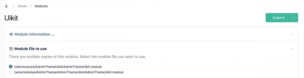
Choose the correct location and your new theme should be visible when you save this page. Of course, this is a long winded way to create a custom theme but currently the only way other than modifying core files (bad) or setting up css overrides in the admin.
In the future, myself (and other members of the forum) are looking at a module to do things like colour changes but this is still just an idea. If anything, at least you would have learned more about how less works (imports, variables etc.) and how to make custom themes with uikit 3 which are pretty sweet skills themselves!
You can also check out a demo of the above theme in action:
https://www.youtube.com/watch?v=cKlzg_kIi-w (404)
// just change the line:
@theme-primary-background: @teal;

// to one of the colours listed at the top:

// Custom colour scheme
@orange: #f0ad4e;
@teal: #2a92a3;
@pink: #ff5b77;
@pink-light: #ffe7ea;
@purple: #613d7c;
@blue: #648db2;
@green: #25b076;
@red: #ab1711;
@yellow: #e5e8b1;
@black: #000000;
@white: #ffffff;
@orange: #ed912d;

// i.e.
@theme-primary-background: @pink;
// then recompile (npm run compile)